Sans Forgetica Is Hard to Read, Easy to Remember
 Oct-06-18
The Sans Forgetica font helps you remember what you read by being slightly more difficult to read.
Oct-06-18
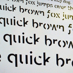
The Sans Forgetica font helps you remember what you read by being slightly more difficult to read.Developed by a team of behavioral scientists and design specialists from RMIT, the Sans Forgetica font is based on the concept of ‘desirable difficulty,’ which states that making a task more difficult increases memory retention. The resulting font—sans serif, slanting in the opposite of normal italics and with pieces of the letters missing—was tested among other fonts, where it “broke just enough design principles without becoming too illegible and aided memory retention.”
More Info about this Invention:
[WASHINGTONPOST.COM][SANFORGETICA.RMIT]
Add Comment
i am looking for a download app for my desktop pc
Posted by roger woodard on September 28, 2019
fields are required.
Comments
i am looking for a download app for my desktop pc
Posted by roger woodard on September 28, 2019
Add your Comment:
[LOGIN FIRST] if you're already a member.fields are required.
Show 1 Comment